
 Build Faster with AfterBox
Access over 4000 ready-to-use materials for Unreal Engine, V-Ray and Corona.
Create your account and receive $12 free credit.
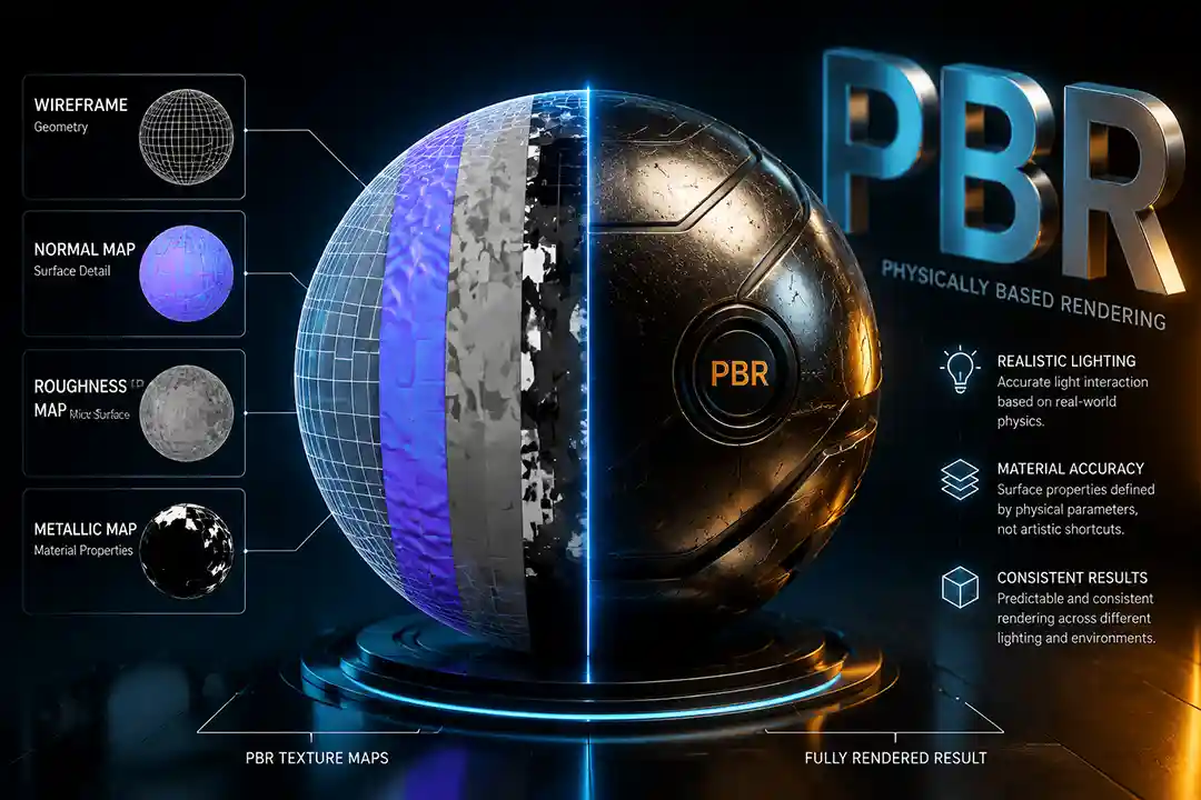
PBR (Physically Based Rendering) is a texturing and shading approach that simulates how light actually behaves on real-world surfaces, using a set of specialized texture maps instead of hand-painted highlights and shadows. This guide breaks down every common PBR map, what it looks like, what it does, and when you actually need it.
What Is PBR, Really? (And Why Texture Maps Matter)
If you’ve spent any time in 3D — architecture, games, product visualization, whatever — you’ve run into the term PBR. Physically Based Rendering is a method of describing materials that’s grounded in actual physics rather than an artist’s guesswork. Before PBR became the standard, texture artists painted shadows and highlights directly onto a single color texture. It looked fine under one lighting setup and fell apart under another, because the lighting information was baked in rather than calculated.
PBR fixes that by splitting a material into several separate maps, each describing one physical property — color, roughness, metalness, surface bumps, and so on. The render engine (V-Ray, Corona, Unreal Engine, whatever you’re using) reads all these maps together and calculates, in real time or at render time, exactly how light should bounce off that surface. The result: the same material looks correct in sunlight, in a dim interior, or under colored studio lighting, without you touching a single setting.
This is why PBR became the default workflow across 3ds Max, Blender, Unreal Engine, and pretty much every modern renderer — it’s consistent, it’s shareable between software, and it just looks right.
The Main PBR Texture Maps Explained
Albedo / Base Color
This is a full-color image, and it looks exactly like a flat, evenly lit photo of the material with zero shadows, highlights, or reflections baked in. Its only job is to define the raw color of the surface. If you see any shading or lighting information in this map, something’s wrong with it — that’s the render engine’s job, not this map’s.
Should you use it? Always — this is the one map every material needs. There’s really no downside here since it’s just color data.
Normal Map
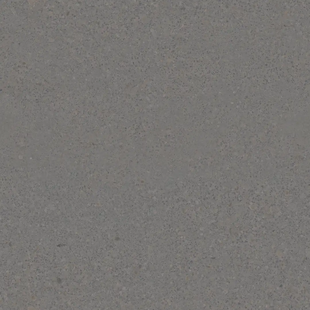
A normal map is that bluish-purple image you’ve probably seen in every texture pack. It doesn’t store color information at all — the RGB channels encode a direction, telling the renderer which way each tiny point on the surface is “facing.” This tricks the light into behaving as if the surface has small bumps, cracks, or grooves, even though the actual geometry underneath is completely flat.
Should you use it? Almost always, yes. It’s one of the cheapest ways to add surface detail without adding a single polygon. The only real downside is that it can’t create actual silhouette detail — from a grazing angle, or right at the edge of an object, the illusion breaks down because there’s no real geometry there.
Displacement Map
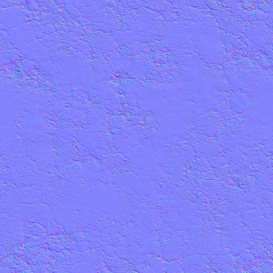
This one is grayscale — black and white, sometimes with gray in between. Unlike a normal map, which fakes bumps, a displacement map actually pushes and pulls the real geometry of your model based on how light or dark each pixel is. White areas get pushed out, black areas stay put or get pushed in. That means displacement creates genuinely three-dimensional detail, including correct shadows and silhouette edges, which a normal map simply can’t do.
You’d want displacement on materials with deep, chunky surface variation — things like rough stone, cobblestone, tree bark, thick brick, or a heavily worn concrete floor. You generally don’t need it on flat or fine-grained materials like painted drywall, glass, fabric, or smooth plastic, where a normal map alone does the job just fine.
Should you use it? Only where it’s actually needed. Displacement is genuinely expensive — it can add significant load to your GPU or RAM because the renderer has to subdivide the geometry to apply it, especially at high resolution. Using it on every material in a scene “just in case” is one of the fastest ways to make a project sluggish or crash your renderer.
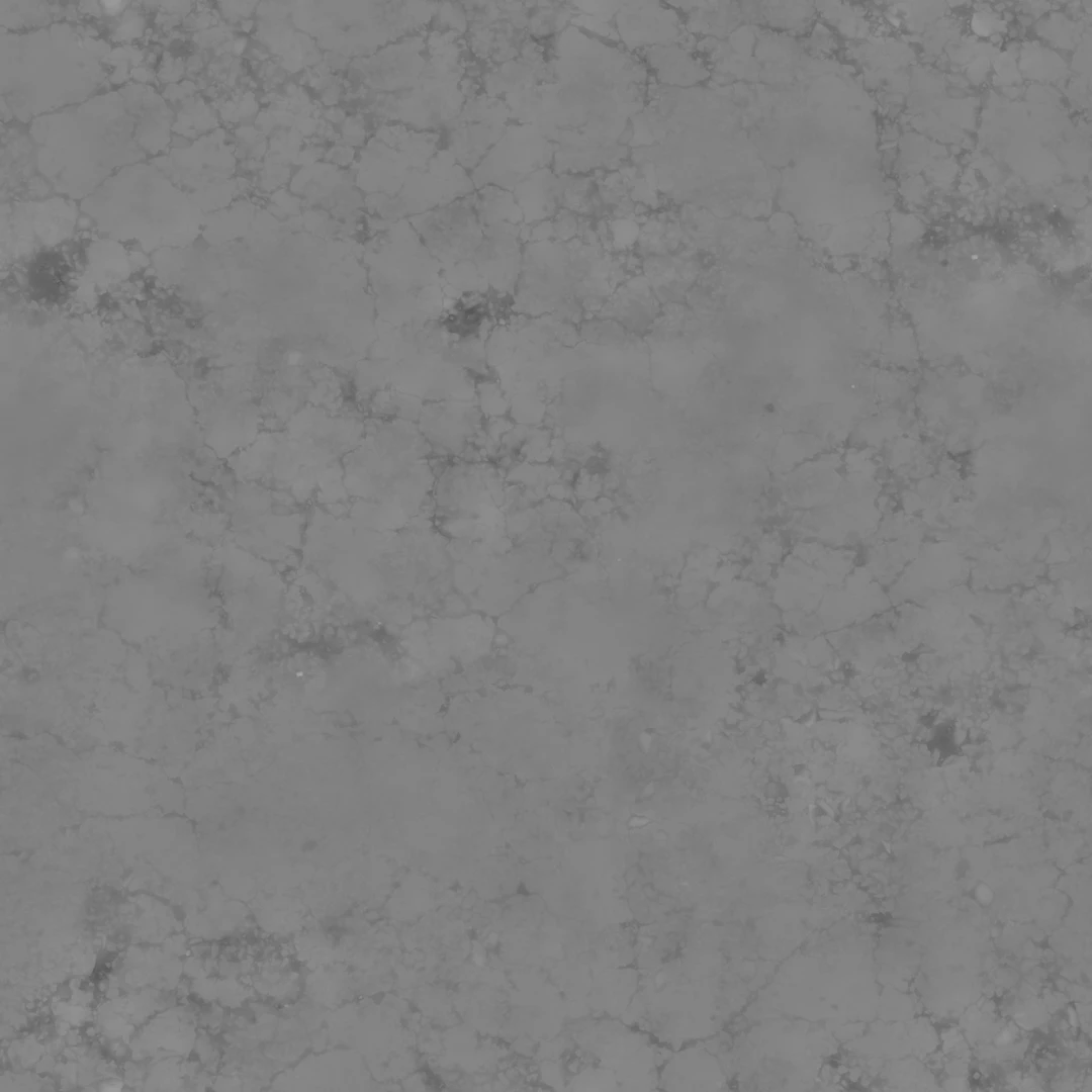
Roughness Map
Also grayscale. This map controls how sharp or blurry reflections are across the surface. Black areas are close to mirror-smooth, producing tight, sharp reflections; white areas scatter light more broadly, producing soft, matte reflections. A single material can have both — think of a scratched metal surface where the scratches are rougher than the surrounding polished area.
Should you use it? Yes, essentially always, alongside the base color and normal map. It’s one of the core three maps in the standard metallic/roughness workflow and has a huge visual impact relative to its (small) file size cost.

Metallic Map
Another grayscale map, though most materials only need a flat value rather than a painted texture. Pure black means the surface is a non-metal (wood, plastic, fabric, stone); pure white means it’s a raw, unpainted metal. Metals and non-metals reflect light in fundamentally different ways, so this map tells the renderer which physics rules to apply, pixel by pixel.
Should you use it? Yes, if you’re using the metallic/roughness workflow (which most modern engines default to). It costs almost nothing in terms of performance and is essential for correct results — skipping it usually makes a material look like flat plastic.
Specular Map
This one shows up more in the older specular/glossiness workflow rather than the metallic/roughness one. It’s usually a grayscale or slightly tinted map that defines how intense the reflective highlight is on non-metal surfaces. Bright areas reflect more light back at the viewer; dark areas reflect less.
Should you use it? Only if your engine or renderer specifically uses the specular workflow instead of metallic/roughness — using both at once is redundant and can actually cause bugs. For most modern architectural visualization pipelines using V-Ray, Corona, or Unreal, metallic/roughness has mostly replaced this.

Glossiness Map
This is essentially the inverse of a roughness map, and it belongs to the specular/glossiness workflow. White means glossy and sharp, black means rough and diffused — the opposite convention from roughness, which trips people up constantly when switching between the two systems.
Should you use it? Only if you’re deliberately working in the specular/glossiness pipeline rather than metallic/roughness. Don’t mix the two conventions in one material.
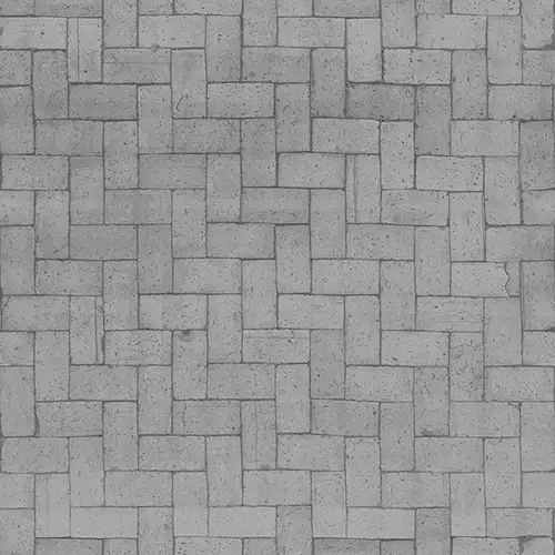
Ambient Occlusion (AO) Map
A grayscale map that fakes soft contact shadows in tight crevices, corners, and areas where surfaces meet — places where ambient light would naturally struggle to reach. Dark areas sit in the cracks and seams; lighter areas sit in more open, exposed parts of the surface.
Should you use it? It depends on your renderer. In offline renderers like V-Ray or Corona, real-time global illumination often calculates this kind of occlusion accurately on its own, making a baked AO map somewhat redundant — sometimes it even causes crevices to look unnaturally dark. In real-time engines like Unreal, where lighting shortcuts are more common, an AO map genuinely helps ground objects and add depth cheaply.
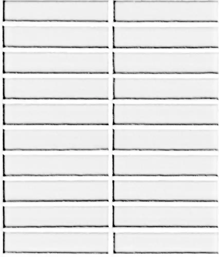
Opacity / Alpha Map
A grayscale map where white means fully visible and black means fully transparent (with gray values in between for partial transparency). This is what makes things like leaves, fences, curtains, or fabric mesh look like they have real cutout detail without you having to model every single gap by hand.
Should you use it? Only where you actually need cutout transparency, like foliage, grates, or fine fabric. Adding it to solid, opaque materials adds an unnecessary extra texture with zero visual benefit.
Emissive Map
A full-color map that defines which parts of a surface glow or emit their own light, independent of the scene’s lighting — think neon signs, glowing screens, or light strips.
Should you use it? Only on materials that are actually meant to look lit from within. It’s cheap to store but can noticeably increase render or shading cost if it’s driving actual light emission into the scene rather than just a self-lit look.
Height / Bump Map
Sometimes confused with displacement, but different. A height map is grayscale and can be used two ways: as a lightweight bump map (fake shading based on brightness, similar to but cruder than a normal map) or as the source data used to generate an actual displacement effect. On its own, a bump map is cheaper than a normal map but generally looks less convincing.
Should you use it? Bump maps are mostly a legacy option at this point — a normal map almost always gives better results for a similar cost. It’s still worth knowing since some older asset libraries and simpler engines still rely on it.
ORM / Packed Maps (Occlusion, Roughness, Metallic)
Rather than three separate grayscale images, an ORM map crams all three into a single texture — occlusion in the red channel, roughness in green, metallic in blue. It looks like a slightly odd, muddy-colored image rather than three clean grayscale ones, but functionally it holds the same three maps.
Should you use it? Yes, especially for real-time engines like Unreal. Packing maps this way cuts down the number of texture files and texture reads the engine has to handle, which directly reduces memory usage and improves performance — with zero visual quality loss, since it’s just a smarter way of storing the exact same data.
The Real Trade-Off: More Maps Isn’t Always Better
Here’s the thing that trips up a lot of people new to PBR: adding every possible map to every material doesn’t make your scene more realistic — it just makes it heavier. A high-resolution displacement map on a hundred different objects in a single scene can eat through your available RAM fast, slow down viewport performance, and add real-time render lag, all for detail that might barely be visible in the final shot anyway.
A smarter approach is to be selective. Use displacement only where the material genuinely needs deep surface relief. Skip AO baking if your renderer already calculates occlusion accurately through global illumination. Pack maps together (like ORM) wherever your engine supports it. And keep texture resolutions matched to how close the camera will actually get to that surface — a background wall doesn’t need a 4K normal map.
Optimized, well-compressed texture sets keep your scene light, your viewport responsive, and your render times shorter, without any visible drop in quality. That’s really the whole goal of a good PBR workflow: physically accurate results delivered as efficiently as possible.
On that note, all the textures in the AfterBox material library are compressed and optimized this way — full PBR detail with no visible quality loss, built specifically to keep your scene lighter across V-Ray, Corona, and Unreal Engine.
